joi, 28 octombrie 2010
vineri, 27 martie 2009
Windows 8 Concept | Windows 8 Beta
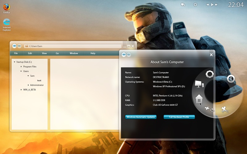
this one looks awsome. simple but awsome. the other one looks more like ubuntu. multiple os’s displayed in the about section. nice.
Back to the deviation. With the Alpha version, I made one big mistake: I just made it from scratch, without an example. Now I used a screenshot of Vista as an example, and personally I think it turned out loads better.
by ~sssssam
joi, 26 martie 2009
Windows 8 Concept | Windows 8 alpha
it looks more like ubuntu and windows 7…
As you can see, the task bar and Windows menu have been abandoned in favor of a circular wheel that appears only when you need it. Running apps can be seen in the upper right corner next to the clock. The Aero interface has been revamped with even more spectacular effects, and Windows Explorer has a more logical, simpler hierarchy much like the one in Mac OS X.
by ~sssssam
wellcome
Mike.


